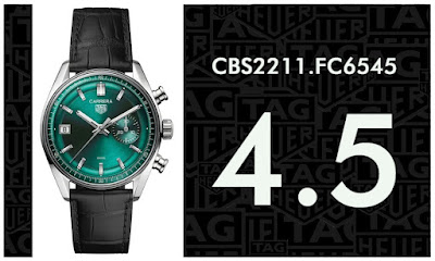
CBS2211.FC6545
I've said many times before how the hardest posts to write are the ones where you feel nothing for a watch, about how much easier it is to write when you feel really strongly (one way or the other), and yet I'm struggling to start this one. Honestly, I'm really struggling...
You know, one thing I've always loved about TAG Heuer is that you never quite know what they're gonna do next. But obviously, with that kind of unpredictability comes uncertainty; sometimes they hit it out of the park and sometimes they fumble the ball. Unfortunately the new Dato in teal green is one such example of 'fumbling the ball'... and for once I'm not standing on my own screaming against the crowd, because the Heritage lovin' COCO, who I thought was gonna lap this up, don't like it much either.
Consider me shocked!
After all, these are the same people who voted the previous Hodinkee Dato the '2021 COCO Watch of the Year'... and yet here we sit with the new Dato scoring way down in the dumps with watches like the 'Year of the Rabbit' Carrera and the brown dial Aquaracer. Yeah, I definitely wasn't expecting that!
But even I (as someone who did not find much to like about the Hodinkee Dato) can see, put the two together side by side and suddenly the 2021 version transforms from something of an ugly duckling into a swan. Meanwhile this new one just looks weird and an all round BAD IDEA.
I mean, I get why the 2021 version sold out in a day, it's a unique looking 'Heuer branded' watch that had the full weight of the Hodinkee hype machine behind it. Plus it harks back to the days of Jack Heuer and all that, but this new TAG Heuer branded version just doesn't have that 'credibility' and without that appeal to it I just don't know who's going to look at this and think it looks 'pretty', do you know what I mean? Maybe if it was presented in a less 'fashion' conscious colour it could have worked, maybe a light grey or something similarly purposeful, but this super flashy green just ain't it.
While we are on the topic of the colour I noticed that Hodinkee apologised for the photographs that went with their article, saying that it was 'very difficult' to photograph. Meanwhile in the comments someone said it looked as if the dial had been painted 'by my daughter... with nail varnish'. Ouch! And that colour isn't making that weird new glassbox design look any better is it? Honestly, it looks clunkier than a box full of clunks.
Pfft. Man I don't like sitting here and slating a new watch from my favourite brand, but honestly I'm holding back - big time. So to save myself any more stress I think I'm just going to hand this over to the Council of Considered Opinion and let them tell you how it is. I don't know, let's hope Hodinkee are right and it is difficult to photograph; maybe we just need to see it in person?
Well maybe, but for now I'm giving it the benefit of the doubt and what I consider to be a very generous '3'... mainly cos I don't hate it like I hate the reverse panda.
5/10: "Nice colour, but there's something not quite right here. The space on the left of the dial looks wrong. And it's just nowhere near as good as the original glassbox teal Carrera from a couple of years back."
6/10: "Better as a 3 hander, on dark green strap."
3/10: "I don't like the new glassbox design. I don't like the date display shoved all the way to the left, and the subdial colour should have matched the date display."
3/10: "I don't know why they made this vintage look green."
4/10: "Just looks disjointed and behind the fad."
5/10: "I had high hopes when I heard ‘teal glassbox Dato’. But with that tiny subdial in the same colour as the dial it just doesn’t have any visual impact. Would have been much better with an oversized silver subdial."
3/10: "What a masterpiece! A nod towards heritage, Steve McQueen, Jack Heuer's brilliance and billions of years of history put into one piece of watch. Just as exciting as Steve McQueen performing constant action in many many superb car chases in 'Bullit', this new magnificent Dato makes me feel things. Heritage. Respect. Jack Heuer. Mac and Queen. OK no but seriously. 3/10."
5/10: "This combo is not working for me."
4/10: "The dial is nice but I don't like the position of the date wheel and the placing of the subdial makes it appear unbalanced, as if there's something missing."
7/10: "Two green Carreras... I’m going to score this at 7 because it’s not a tourbillon lol. I’m still not sold on green dials just yet."
3/10: "Honestly, I just don't like the Dato. The date and sub dials are far too wide on the dial face and just look unbalanced and odd. The teal dial itself is ok though."
6/10: "This has too much open space for me and just seems like something is missing. The last Hodinkee Dato having the subdial in another colour helped bring a bit of balance. Would have preferred something closer to that design and in a different colour."
3/10: "Horrible!"
7/10: "Managed to see this watch while travelling recently. I really liked the green that they have used. I score this a bit more than others have."


Wow. I rated it the highest… That does surprise me a little. I just wish the dial was anything but green.
ReplyDeleteOh well, plenty more chances to get it right.... haha
DeleteRob
I hear this one is a hard sell for the boutiques. I can see why, because it sure aint pretty
ReplyDeleteNeeds a running second hand. How do point out the sweeping seconds hand? Hahahaha. Rob
Delete