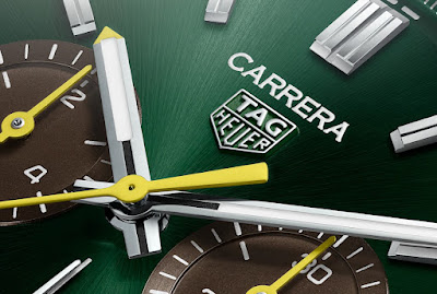
At the end of my half year review I mentioned that I thought the 'COCO Watch of the Year' would be some sort of Carrera, but one we hadn't seen yet. Well in the last couple of weeks we've had four more Carreras and I believe that one of those could be 'WOTY', but probably not the one I'd like it to be. 😜
More on that anon, suffice it to say that the watch I am referring to is perhaps the most Marmite watch of the year so far. I love it, and a couple of others do too, but unfortunately the majority of the Council of Considered Opinion get a case of the vapours when you mention '44mm', 'Carrera' and 'diamond bezel' in the same breath...
Now I must admit at first glance I thought this looked quite cool, but once I realised the subdials (and strap) were actually brown and not black I found myself cooling on it. To my mind it gives the watch a 'vintage' feel that seems slightly at odds with the bright yellow highlights (no mention of sparks for this one I notice...), and for some reason it makes me think of string-backed driving gloves.
I'm sure some will take exception to the continued use of yellow on another chronograph, especially one that looks kind of old fashioned, but that really doesn't bother me. Red would have worked, had the subdials been black... in fact if the subdials had been black I'd wager the highlights would indeed have been red; as boring and predictable as that would inevitably have been.
It's funny how one small detail can make such a difference, and I'm not against brown per se; in fact I tried on a brown dial Grand Carrera chronograph once and I rather liked it. But somehow it doesn't work here for me. Had the subdials been black I would have given this a 7.0 or even a 7.5, but as it is I'm afraid all I can muster is a rather generous 6.5.
Perhaps the string-backed glove wearing, 'Council of Considered Opinion' will look more favourably on it? Let's find out...
4/10: "I like the green dial but not the brown subdials as I think they make it look really old-fashioned. The strap is OK because it's really dark brown."
5/10: "Not sure about the brown sun dials so scoring it a 5."
6/10: "Not sure how I feel about the sub dials colour contrasting with the green dial. That said the yellow hands do look lovely on them."
4/10: "Not a fan of brown, silver sub dials would work a lot better. Overall a nice attempt at designing a Carrera."
4/10: "Well these 42mm Carreras are probably the best looking of the current line-up (a shade too big for me, just saying). The green is nice, but I'm not sure I would have paired it with brown subdials and bright yellow hands. Overall effect is OK, but there are definitely nicer colour schemes out there."
5/10: "Cow pats in a field, that's what it looks like."
3/10: "It’s just needs round indices in 7 different colours and an “integrated” bracelet with a Riley plaque glued on. 🤣Joking aside, I like the Green Dial and can live with the Brown Strap, but those sub-dials are atrocious."
5/10: "Would have scored this one as 8/10 if the yellow and brown accent colors were left off the dial. This one would look amazing with white/off white subdials and if it lost the yellow accents."
5/10: "After Looking at it for a long time, I have come to the conclusion that the brown is just not it for me. Perhaps light brown would have been better?"
4/10: "Zzzzzzzzzz. Another green watch. Another shitty glassbox. Another running seconds."
8/10: "I think its okay. the subdial of brown colour make it striking and not to mention the yellow hands."
6.5/10: "It’s hard to tell from the renders - the colours don’t really work for me green/brown/yellow - so, 6.5 assuming it looks better in person."
3/10: "The colour scheme doesn’t work at all."
7/10: "Promising. I would love to see actual photos."
5/10: "I'm not a fan of Green."
7/10: "I kinda like the colourway, even if these look better with a contrasting chapter ring."
6/10: "I like the base model and green in general, but I’m not a huge fan of the violent yellow contrasts on this one: Works for a diver but less for a classy chrono, IMHO…"
7/10: "Looks good. Cool colour scheme. Remembers me of the Lacoste brand. But nothing too exceptional."
8/10: "I’ve been annoyed with green watches for the past three years, but I quite like this color combo. From how it’s rendered on my phone it kinda sorta reminds me of Aston Martin green."
6.5/10: "I don't see a connection with Europe, but yellow details on a "British Racing Green" background could have reminded us of a Jim Clark’s Lotus... but the brown subdials ruin everything. That's why for me it's only a 6.5/10."
5/10: "Europe? Why? But the watch isn’t bad although the brownish sub dials don’t do anything for me, price seems OK."
7/10: "I like it. But I think last year's crop was better, i.e. Team Ikuzawa, France and CC. If going for a green dial Carrera Elegant, I'd also opt for the Bamford Ruf version over this one."


I agree, this looks like a bad joke
ReplyDelete