


WBP201D.FT6197
When I first saw the new '2021' Aquaracer, I must admit I wasn't exactly jumping for joy... then a few months later I got to see one in the flesh and I was like, well, actually it's not as bad as I thought. I still didn't exactly 'love it' and I certainly didn't 'want' one, but at least I now knew it was one of those watches that looks better in real life than it does on a screen (yes that is a 'thing' kids, go to an actual shop* and see for yourselves!)
*'Shop'... I've just realised that creeping Americanization of the English language means that 'shop' no longer sounds 'correct' and I want to change it to 'store'. I will resist!
So while as yet I'm still not 100% convinced by the new Aquaracer, I do think that eventually I'll get used to the new look and it will feel more 'familiar'. Right now it still feels a little 'wrong'... like it's not really a proper 'Aquaracer'. But maybe that's just a by-product of the previous range being so damn cool looking that I really didn't want it to change and so all those supposed 'improvements' feel unnecessary and actually somewhat 'detrimental' in my eyes. Ironic right, I moan about other brands never changing and praise TAG Heuer for not standing still - until it doesn't suit me! Haha.

A few months ago a picture appeared of the new 'Night Diver' (turns out it had been openly displayed on a Chinese website since March!) and I thought 'here is the model that's going to turn it around for me'. Well, now the watch has been officially released and sadly it feels like a huge let-down.
As I'm sure you'll know by now (because by the time you get to read this you'll have already read about this watch on A Blog to Watch, Monochrome, Hodinkee etc etc) the 'Night Diver' follows on from the 2018 quartz edition which I tried on at the time of release and found somewhat 'underwhelming' (despite the fact that it looked great in photos - the irony).
You're also sure to know that the 'Night Diver' has its roots in the very cool 1980s '1000 Series' which has a rather desperate (if you ask me) association with Timothy Dalton's 'James Bond'. I mean, seriously, can we not do this? Let Omega embarrass themselves and let us take the higher ground, please! There's like two seconds of shoddy footage of Dalton grappling with someone with a black, lume dial watch on his wrist and people are creaming themselves over it.... it's not even like Timothy Dalton is a 'proper' Bond!!!

So anyway, where was I? Yes, the quartz model came out in 2018 and I was excited and then I saw it and I wasn't. But in recent times I've started to wonder if I was a bit hasty in my dismissal... I think it was partly because I was expecting a brilliant white dial and it's actually quite silvery, which I didn't expect. Knowing that now I might have a different take on it... but in any case, since I've put the rubber strap on my WAY208C I wouldn't be looking to buy because it's a bit too similar.
But let's get back to the Calibre 5 model... on paper it ought to be 'better' than the quartz model, unless you're a movement snob, in which case there's probably no point even talking about it. Personally I'd rather take quartz for 2/3rds of the price and 'eternity' be damned, but I do love the slatted dials that only come with automatic movements so that should be a point in the WBP201D's favour.

But while the quartz dial was disappointingly silvery, it appears that the Calibre 5 dial is disappointingly creamy. Obviously this bears further investigation and I feel like this is something I won't truly get to the bottom of until I see one up close, but for the moment at least it's a bit of a bone of contention for me.
And... let's not beat about the bush here, there are some significant differences between the £1850 WAY108A and the £2750 WBP201D: both are 43mm, both have ceramic bezels, but while the WAY108A is coated titanium, the new model is coated steel. Hmm. And not only that, but the hour markers on the quartz are lumed whereas only the 12, 3, 6 and 9 are lumed on the Calibre 5. That's not really a big deal and TAG Heuer will probably say it was a conscious choice to make it look more like the 1000 Series, but yeah... it's less lume for your money.
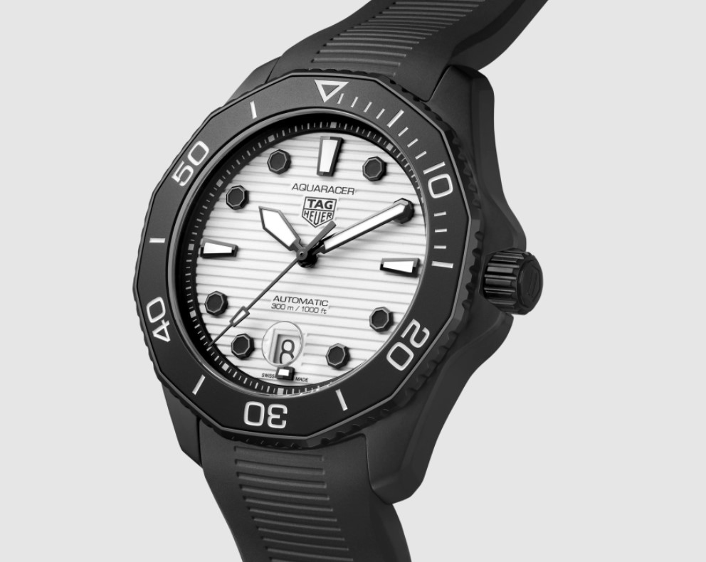
Also, close up I still don't like those octagonal hour markers, and in black they look even worse than on the regular models. Which is a shame, but not half as much of a shame as the fact that it appears that whereas the WAY108A has a fully lumed bezel the new model just has a lumed triangle at the top. All of which makes me wonder why on Earth I would want to pay an extra £900 just to get a sweeping second hand, a (potentially disappointingly creamy) 'slatted' dial and an inferior (and cheaper) case material.
Interestingly there was some debate about the lumed bezel issue on the Calibre 11 forum (or 'Club BB58' as I'm calling it now) with some members claiming they had seen shots of the watch on Instagram with what appeared to be a fully lumed bezel. Well, all I can go on is the 'lume shots' I've seen on the internet and the product page on the TAG Heuer website which clearly shows a bright green triangle and nothing more. Maybe they saw some photos of a prototype or something?

So yes... sadly, I'm not as excited by this release as I was hoping to be, which leaves me wondering if I'm ever actually going to 'fall' for the new Aquaracer?
I do quite like the new rubber strap though and this is now also available on the standard blue and black dial Calibre 5 2021 Aquaracers (blue rubber on the blue one; not sure why there's no black rubber option for the silver dial?). These also come with the excellent new clasp but the downside is you have to cut the rubber to length. Still, there's oodles of adjustment so unless you gain like fifty pounds it probably won't be a massive issue.
So, consider me slightly disappointed but willing to take another look... hopefully it won't be too long. Until then I guess we should consult with the esteemed C.O.C.O. Council and see what they make of this one...

WBP201D.FT6197: 6.8 / 10
"9/10 for me! It's the modern day James Bond watch for me which is a TAG Heuer!"
"As the spiritual successor to the 'Living Daylights' watch, it gets a 007."
"Out of the current Aquaracer line-up, this is one of the more appealing pieces, even though it's a homage watch rather than a true reissue. It mixes modern Aquaracer elements with the original night diver, and ends up looking a bit less messy than some of the other models. That said, I still don't like the octagonal hour markers or the cyclops at 6 o'clock, and the less said about the calibre 5 movement and TAG's overall refinement on these lower-end models the better. Oh, and it's too big. One further criticism is the use of white lume on the hands and 12-3-6-9 markers which contrasts badly with the other black hour markers. I know it's consistent with the original night diver, but I think a black handset and all black markers would have been more readable and contrast better against the all lume dial. 4/10"
"I really like it, 7.5 is my vote. Still warming up to the indices and 43mm size"
"7/10. Went and tried it on today. The updates over the previous quartz version are actually really cool in person - most notably, the matte finish on the bezel vs the old polished version. It feels smaller than the 43mm dimensions obviously, and the white background of the date window is better integrated on this model than on the others. The horizontal lined dial works much better in a matte finish as well compared to the polished dials of the other Aquaracer models. It's one of those watches that I would probably buy if I didn't already know I would probably end up not wearing it..."
"6.5. That's about all I got to say bout that."
"7.5 for me. I want to love it, but it's just not there."
"5/10. This is my favourite so far of the new Aquaracers, but as a watch I still don’t love it. To recap, I miss the bezel lugs which were unique to the AR, dislike the Rolexification with the bezel grip teeth, hate the octagonal hour markers and the ‘different for the sake of it’ 6 o’clock date window and the horrible cyclops. Moving on to the comparison against the old night diver, I don’t think I like the lines of the dial but need to compare in the metal, part of what I love about the old model is the monochrome aspect, the stark contrast of the white dial and black casing. The new strap looks like a big improvement, the old strap is not particularly comfortable and the clasp rattles, and the new case back looks smart. It’s a shame it’s steel not Ti- how will this wear with PVD? Overall this feels expensive. £200 more than my much more premium BB58 and around £1000 more than the old model that was Ti?!"
"8 from me. Love it. I normally do not gravitate towards a white color dial but this one for the sake of the lume dial, yeah that's cool."
"7/10. If possible, I hope Tag will reproduce a limited number of the heritage edition with 'Heuer' logo."
"I like all of those full lume iterations. But to be honest, this one does not appeal to me as much as the others. Don't know why, msybe it's the dial lines. Maybe they look better/different in reality. Contrast and readability might also have been even better with no lume hands and markers, depending on duration of the dial afterglow. I am still excited by the 844 homage, as well as the titanium green one. Score 5/10."
Additional reading:
Calibre 11 Review of the new Calibre 5 Night Diver
On the Wrist post for the Quartz Night Diver
No comments:
Post a Comment