


CBE511B.FC8279 WBE511A.BA0650 CBE511C.FC8280
I literally don't know where to start with writing this post, I really don't. So, a quick 'catch up' for those not well versed in the history of the model. The Autavia was originally launched in the 60's and was briefly brought back to life about fifteen years ago with a TAG Heuer dial and disappeared again almost as quickly as it appeared. Nothing more was heard of the Autavia until 2016 when (then TAG Heuer CEO) Mr Jean Claude Biver announced the Autavia was being resuscitated once more, only this time in a regular 42mm case with an in-house chronograph movement and (importantly for the cognoscenti) a 'Heuer' dial.
Autavia fans seemed largely happy with this (apart from the usual moaning about it being too big and too thick) and for a while all was well. Then we started to see some special editions, including the JH85, Calibre 11, UAE, Hodinkee 'Orange Boy' and 'Viceroy' all of which were well received. But then at Baselworld 2018 pictures were leaked of some pretty woeful looking three handed Autavias, including a particularly ropey looking GMT and about a year or so later we started to hear that maybe the 2017 Heuer 02 chronograph was being discontinued.

Thankfully the watches in the leaked pictures didn't make it into production, but a year or so later we got a redesigned range of three hand Autavias which were now being sold as 'Pilot' watches with oversized crowns. I didn't like them in the pictures but when I actually got to try one on I changed my mind and was actually quite impressed with them. But of course the Autavia fans were insane with rage. 'These are not Autavias' they screamed belligerently, as they gathered in mobs, clutching pitchforks and threatening to storm the gates of the TAG Heuer factory.
Well, okay... not quite, but they weren't happy. And you know, I kind of understand. But you see the problem is that all the watch companies got rid of the guys who think up new watch names years ago and no one else has been trained. So there we are, we're stuck with the names we have already... and if something new comes out it's just going to have to fit.

CBE511B.FC8279
Besides, what is a watch without history? When was the last time a (luxury Swiss watch) company brought out a new watch that wasn't originally conceived of at least fifty years ago? Well yes of course Bulgari's Octo Finissimo, we all know that.... but that's an anomaly (along with all the others you can think of). But honestly... look at Chopard with their Alpine Eagle, a beautiful watch that looks sod all like anything they've made before, but they still felt the need to tell us that it was based on the St Tropez from the 1980s.
So why not call it the 'St Tropez' then? Well.... apparently, St Tropez isn't as glamorous as it used to be. So why mention it? It's not like anyone else would have made the connection. Simple; watches must have history, or what on Earth do they babble about in the press release? History is the watch industry's 'angle', it's their selling point.... why do you think TAG Heuer endlessly bang on about Steve McQueen?
Anyway, so the new three handed Autavias eventually came out, replete with carbon hairsprings... which as we all know spectacularly failed to work properly for more than five minutes, inevitably leading to a recall and ultimately the whole 'Isograph Autavia' project being chucked in the bin. A few months later most (but not quite all) of the watches were re-issued with chronometer certified Calibre 5 movements and without the 'Isograph' text on the dial. And until now that's been the story of the Autavia: redefined as a three handed 'Pilot' watch, that's what it is now, just deal with it okay!
Only now we have an Autavia chronograph, and not just a chronograph, but a flyback chronograph. Could this get any more confusing?

CBE511C.FC8280
Okay that was a lot longer recap than I was anticipating... but you get the picture, the Autavia has not had an easy ride and nor does TAG Heuer really seem to have decided exactly what they want to do with it. But then again I guess if you compare it with the various iterations of the Carrera, the Autavia actually seems fairly focussed! Hahaha...
Unlike some (who shall remain nameless) I really don't care too much about the Autavia name, it means less than zilch to me, so I have no axe to grind over the fact that these don't look like they came from the 1960s. And the mere fact that these three watches are wearing TAG Heuer logos on their dials rather than Heuer ones suggests that TAG weren't intending them to look they came from the 1960s either. No, these are supposed to be modern interpretations and as such they should be approached in that spirit.
Let me tell you now right now though, that's not gonna happen in the COCO Council comments... but for me, that's fine.

So, firstly the black chronograph is nice enough for me, it obviously has hints of the Heuer 'Bund' about it, which again is a double-edged sword. I really like the green lume, it looks great with the black and I don't mind the TAG Heuer shield at the '12' position. Is there a little too much text underneath it... yes, sure it's entering Pelagos territory there, but then again it balances out the 6 o'clock subdial so it's not really that bad. The bezel looks a bit too shiny, I will admit that, but honestly overall it strikes me as a good looking watch and one that I'm looking forward to seeing in person at some point (hopefully).
Interestingly, the flyback chronographs feature quick release straps, which are a welcome move from TAG Heuer, especially as they are featuring alternate straps at the very bottom of the product page on their website. However... looking at the bands offered there it looks like they've just linked to all the straps available without any thought going into it. I mean I would be immensely surprised if anyone actually wanted a stainless steel bracelet for their black PVD coated Autavia...

The silver one is not in the same league as far as I'm concerned, and it doesn't really make sense to me to make it a 'faux-Panda' either. I guess a full silver dial maybe wouldn't look all that great, but why not just have three black subdials? You know, like the JH85? Coulda been an easy bit of continuity there, but no they went the other way...
And then there's the price. which as you'll see below, the COCO Council members are carping about. At £5800 for the black model it is a lot of money, but it is a flyback, and it's black and for only a few hundred quid more than a Monaco. Whereas the silver version costs £5250, which is more or less on par with a Heuer 02 Monaco. But it's a flyback chronograph, right... so perhaps it is the Monaco that's overpriced. No?
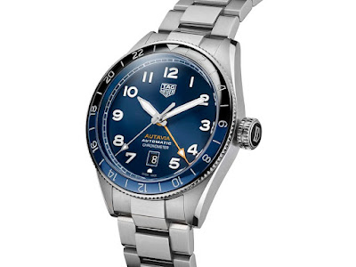
WBE511A.BA0650
Finally we come the GMT, truly the runt of this particular litter. A watch so despised that the Council have scored it a 4.8 out of ten. Now I don't usually reveal the scores up here in the main post, but this is so shocking I just had to comment on it. That score puts it on a par with watches like the brown dial Aquaracer Calibre 5, and only just above the Bamford 'Coffee dial' Carrera and that weird ladies Link with the gold sundial on the dial (or whatever it's supposed to be). This is a truly terrible score.
I don't really get it, I mean, I don't 'love' it myself... I scored it a 6, if only because it's a VAST improvement on the leaked picture I mentioned earlier. But two members of the council hated it so much they scored it zero. This has never happened before... in two years of Council activities!

Now, granted, 'First Impressions' scores aren't final and they don't get entered into the 'league' until they've been ratified at the end of the year, but this is even worse, way worse, than the initial reaction to the new Aquaracer. Will first hand exposure change their minds? Obviously I don't know, but I have my doubts.
For me it's kind of... well, it doesn't really grab me. It doesn't grab me at all, and releasing it alongside the cool looking black flyback chronograph (whatever its faults may be, and believe me you are definitely going to hear about them in a moment) seems like a bit of a bad idea to be honest. Having said that I've spoken to a few people (who don't frequent the C11 forum) who really like it....

So now, it is finally time to turn these over to the pitchfork-clutching Council...
CBE511B.FC8279 (Silver dial flyback): 6.6 / 10
CBE511C.FC8280 (Black dial flyback): 7.3 / 10
WBE511A.BA0650 (Blue dial GMT): 4.8 / 10
"Silver: I would give this an 8/10 nice sliver dial (Sunburst?) And just overall works for me. Black: I would give this a 9 out of 10. This is definitely my favourite of the three. Really like the green lume against the black. If i could afford I would definitely buy this one! (But would need to see it in the flesh first). Blue GMT: I would rate this one at 7 out of 10. There is nothing wrong with this watch. It's a lovely blue and really like the orange GMT hand. Its just the other two that work better for me. Really like this watch though."
"The flybacks are the most interesting, and the dial colours a solid choice, if not particularly inspiring. But even though they're new models, it still feels like variations on a theme, almost like we've seem them before. To me, they're overpriced too."
"Black - 9; the best of the lot, however it's far from perfect... Silver - 8; that oddly coloured seconds subdial is awful. Blue - 7; minus points for the cheap movement."
"Black dial 6/10 - works nicely enough as a callback to the Bund with the mint green lume. But choosing to replace the 12 o'clock numeral with the TAG logo just throws the entire dial off balance for me and makes it look top-heavy. It's a joyous occasion though as the running seconds finally gets a properly readable subdial again! (Even if it's weirdly smaller than the others, which reinforces that strange top-heavy design)
Silver dial 4/10 - This ended up looking like they had a great design for a 2-register chrono, then lost their nerve and added the running seconds back in but in a dial-color subdial. It's a weird, lazy choice and unfortunately it led to a poor-looking result.
Blue dial GMT 0/10 - Microbrand looks and a cheap microbrand movement, yet somehow more expensive than a Tudor Black Bay GMT. Perhaps it might have worked if it were priced at the same ~$1,500 as all of the other cheap ETA/Sellita/Soprod-based 'caller' GMTs but cross-shopped against the Tudor (which has a true jump-hour movement) it's absolutely laughable. Given TAG's reputation compared to Tudor's, I'd be truly surprised to see many sales of this one. Judged solely by aesthetic merit on the other hand, I'd say that it looks like a Baltic design - except Baltic wouldn't have put the date window in such an unsightly, stupid spot."
"I don’t know man but TH is in a bad place and it’s sinking further into the abyss with these watches. I had high hopes for Bove but the dude is a huge disappointment. He killed the Carrera (lugs) and now this. These are some sorry ass watches that no one in their right mind will buy at anywhere near retail.
who the hell wants a crown that looks like an Oreo?? Daytona style mushroom pushers. Are these screw down? Either way, useless.
The black one is the ‘best’ as blackening out everything can make a Fiat Panda look badass. A golden turd is still a turd. The green lume doesn’t save it. Why shiny black? Makes it look cheap. The thin, rounded, shiny bezel is an eyesore. Pretty remarkable that this was the inspiration...


I score this 2/10
The grey one. All of the flaws of the above. Add horrid grey subdial in a different finish and colour as the rest of the dial. A date window hanging out of the subdial like a limp dick....I score this dead panda 1/10.
Last and most of all least the GeeeMTeeeee. No Baltic vibe whatsoever. After 20 seconds in a blender the Baltic would look better than this. The render looks bad, the photos are worse. Nothing about this watch looks right. 0/10!"
"Black dial: 8 (might not only be inspired by the Bund but also the Breguet Type XX, which I like very much). Silver dial: 5 (confusing too many styles, opposite of a clear cut identity). GMT: 6 (nice to have, but I would still rather go with the bronze 3 hander)."
"The black and silver are striking, I'm not 100% on the shield position (maybe it balances the lack of 6?) and the text on the dial seems a touch excessive, but overall they are attractive and unusual. I like the black/pistachio in particular, but the silver looks clean and classy, and will probably look amazing in natural light.
The GMT is the ugliest watch I have seen in a long time, looks like the sort of fake TAG you'd see at a market in Istanbul in the 90s. Can we score 0/10? I guess it's a watch and tells the time so maybe that buys it a 1.
I find it slightly odd there isn't a reference to the movement on the dials.
I'll need to come back to you on the GMT, I'm struggling to find words to describe how much I hate it."
"Black dial. 6/10. A matt bezel might have been better? and a better price!(better for the punter not TH) not sure on the pushers, if they locked down when not in use, I catch things like this on my jeans pockets, lost a Carrera pusher once that way.
Silver dial. 5.5/10. I’d have preferred the reverse panda dial.
Blue dial. 5/10. Nothing shouting Buy Me.
All rather expensive, the way of the world now unfortunately, must be getting overly fussy with age."
And finally...
Silver - 9: reminds me of a silver panda which is always pleasing to my eye. TAG Heuer really makes excellent silver sunburst dials (which is the reason for a high score) As I have said, I’m not a fan of deleted Arabic numbers in the dial but I guess everything will be more cramped to complete it (1-12) in an already busy design. I think it was best to make the hour markers blend with the dial or else, everything will be more cluttered. Obviously TH wanted to make the panda design stand out for this.
Black - 8 : I’m not a fan of this colour combination, but if it would’ve been contrast to a silver or white, I’d give this 8.5 (instead of using baby green) If TH just made it line hour markers instead of arabic numerals, this would’ve been even more great IMHO.
GMT - 7 : This is an old design from TH which is the pilot themed 3-hand next generation Autavia. I have a feeling that if a particular model doesn’t sell quite well and TH obviously has surplus parts for it, they would say and do “Okay, since there’s a lot more parts in the factory, let’s try and make it COSC or probably add GMT function or why not both.”
No comments:
Post a Comment