

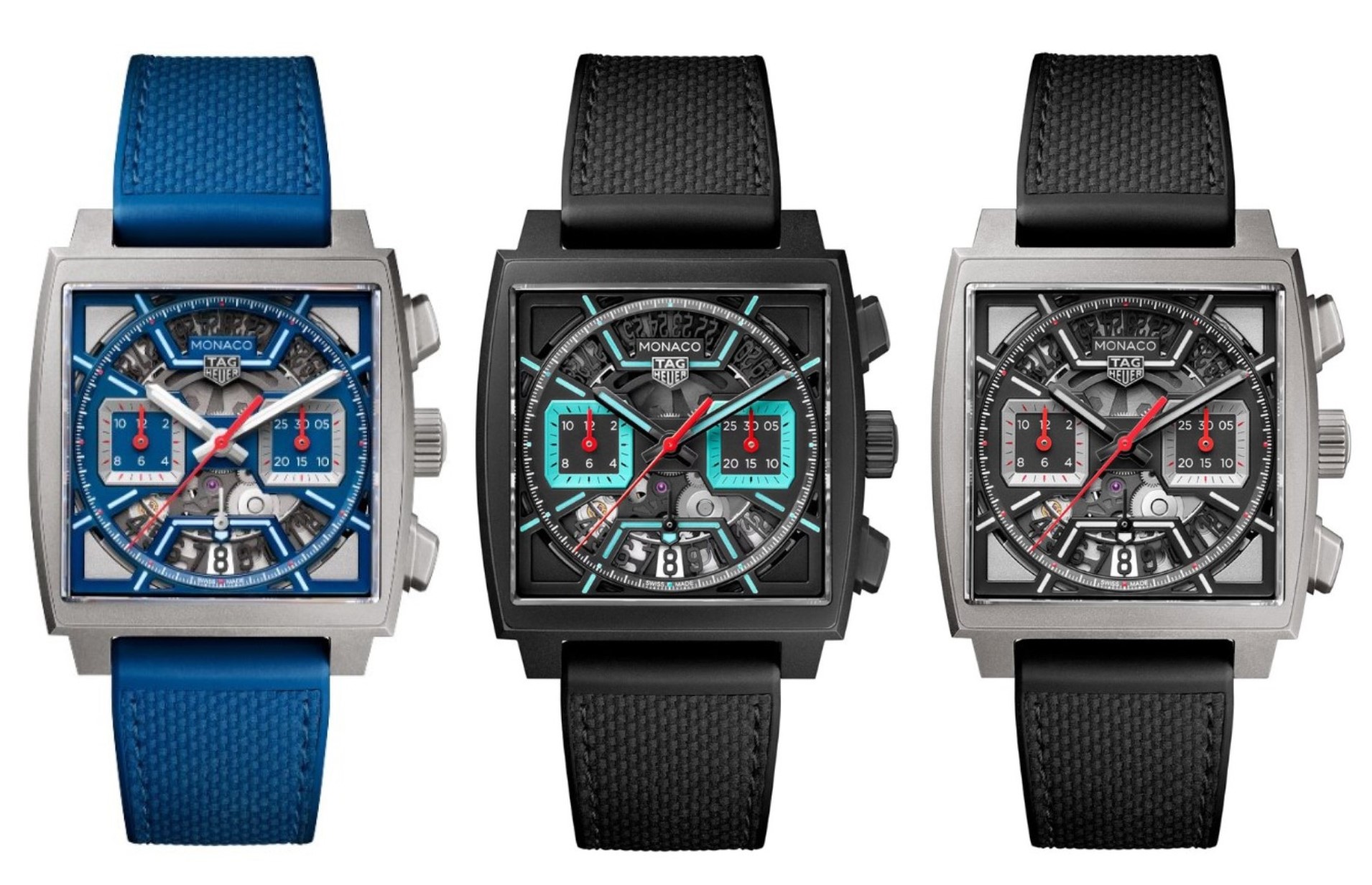
CBL2182.FT6235 CBL2184.FT6236 CBL2183.FT6236
I feel like a bit of a broken record of late, constantly bemoaning the cost of new watches week in week out, and believe me I'm as bored of writing it as you probably are of reading it. But this time is different; not (alas) because TAG Heuer decided to release something I can genuinely hail as 'value for money' but because even the C.O.C.O. Council (some of whom are a lot more financially blessed than I am) are finding it hard to overlook the astonishing prices of these new skeleton dial Monacos. So instead of moaning about the prices at the end of the post like I usually do, this time I feel like we have to address this head on, because frankly TAG Heuer are getting dangerously close to jumping the shark here.
Back in 2016, I bought my Heuer 01 Carrera for the princely sum of £4000. Actually I didn't pay that, but that was the list price, now I know things have gone up in the meantime and maybe you can argue we aren't comparing apples to apples, but even allowing for a bit of that, how is it that these skeletons are all in the £9000 price bracket? It makes no sense. At all. Especially when you consider the 'Dark Lord' tribute (itself thought of as being a bit 'pricey') is in the high £7000s and that has gold hands and hour markers.

But going back to the Heuer 01 for a moment, let's look at the disparity in price between that and a bog standard CV2A1R Calibre 16 Carrera. According to the 2016/17 price list the difference was about 600CHF, so any notion that the skeleton dial and a titanium case is adding a massive cost to the watch is clearly not the case. In contrast the difference between the standard Heuer 02 Monaco and these new skeletons is at best £2850 (for the grey and blue versions) and at worst £3300 (for the black/turquoise), no wonder the Council are finding it hard to stomach the prices. One member actually said he couldn't even score the watches as he couldn't overlook the ludicrous prices. And that has never happened before. Ever!

But, and this is a big but, this is the watch world. I don't like these prices at all, but it's hardly unheard of for watch companies to charge a premium for no reason other than 'our new watch is cool and if you want one you're gonna have to pay for it'. When the Royal Oak came out people were aghast that AP thought they could charge such a price for a steel watch, but you know what... it didn't go too badly. And Richard Mille didn't take off until they started charging stupid money for their watches either. It's a well known quirk of the luxury business that putting a high price tag on something makes it more desirable... and that's clearly what TAG Heuer are trying to do here.

Sadly that means that these watches are probably too rich for the pockets of some people who would otherwise like to buy one, but that's life. What is annoying about that though is that this is not some super-Monaco, this is not a 'Monaco 24' type scenario where they made a genuinely technically superior product containing a Calibre 36 (El Primero) movement suspended on shock absorbers, this is literally a standard Heuer 02 Monaco with a skeleton dial in a Grade 2 titanium case (finished the cheapest way possible).

Pukka Premium Monaco - The Monaco 24
And is it just me that struggles to understand why TAG Heuer would introduce their new improved H02 movement (the TH20-00) in the underwhelming (I realise I am in the minority here) 39mm Carrera while these flagship models get the old movement? At least that might have gone some way to 'justifying' the increased sticker price (well not really but we're clutching at straws here).

No doubt they would say they started work on this before the TH20-00 was ready, in which case maybe it would have made sense to release this first? Seems a bit of a failing in the TAG universe, remember when they released the super-duper carbon hairspring in the £26,000 Nanograph and then released it again a few weeks later in the three hand Autavia. Leaving aside the debacle that turned into, why the hell would you do that?
Okay, let's move on, I'm bored sh*tless talking about the prices. Frankly if you think it's too expensive then maybe it's not aimed at you - right?

Unsurprisingly, I was instantly drawn to the 'fierce and unruly' (TAG Heuer website hypespeak) Luminous Turquoise model, which of course is the most expensive of the three. I know, I know I said I wasn't gonna mention the prices again... I'm sorry. The colour scheme is fantastic, although am I the only one who thinks it should have a Mercedes-AMG Petronas F1 logo on it somewhere? Bit unfortunate that, but still a killer design and best of all the weird corners around the dial are also blacked out so they aren't so noticeable as they are on the other two.

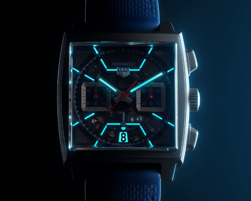
I love how OTT they went with the lume on these watches, picking out the skeleton shape of the dial, but in this case I feel maybe they should have gone even further and lumed the subdial surrounds. Perhaps that would have tipped it over the edge into the £10,000 price bracket though and they thought that was a step too far?
Hahahaha. Oops I did it again.
But we do have a lumed date, which is very cool. I wish they had done that on my Heuer 01.

I can't say I'm overly enamoured of the straps they've chosen here, and again there has been some comment in the THF forum about these, with one C.O.C.O. member absolutely slamming them, which is not what you want on watches at this kinda price.
Sorry. But it's the big, fat, green and red elephant in the room. It's hard not to keep coming back to it...
On the plus side TAG Heuer assure us the straps offer 'maximum versatility' and are 'ready for any accomplishment'. I mean I haven't seen them, so I can only go off these pictures... but they do look a bit flimsy to me.

One thing that's worth mentioning here is that again, like the Monza skeleton, these were originally supposed to be limited editions. I don't know why TAG Heuer have changed their strategy on this, it seems counter intuitive when we know the FOMO effect is quite powerful and you would have thought given the.... outlay required here, a bit of extra pressure on the customer might have been a good idea. But maybe they think these will sell regardless and they've just decided to give us all more time to save up?

The other two I am less fussed about to be honest. The blue looks a bit... umm, blue, frankly. It's just not a classy kind of blue to my eyes, especially in this pri... (don't mention the bloody £££ again Rob!) ...and the black/grey one is, well, a little bit predictable, but then I guess it doesn't hurt to have one model that 'everyone' can get behind. Besides, I can't really say too much about this one since it's essentially a square Heuer 01 Carrera!

Shown here with white lumed hands.... incorrect!
Well there we have it, definitely the 'Ravishing Turquoise' is the pick of the bunch for me, and no doubt when I eventually get to see these I will fall in love with them and convince myself to sell a bunch of watches to get one, but right now I feel quite happy that I don't need to part with a kidney.
One final point though (on the super-duper turquoise model) it seems that on the website the main 'animated' picture shows the watch with white lume on the hands: this is incorrect, as you can see in all the other pictures the watch actually has turquoise lumed hands.
Okay, I'm exhausted, so let's hear from the Council of Considered Opinion, and apologies in advance for the number of times they mention the unmentionable...


ORIGINAL BLUE 6/10, RACING RED 6/10, LUMINOUS TURQUOISE 7/10: "I clearly prefer the classic CAW211P (and many other non-skeleton Monacos) over these skeleton Monacos… but they are nice watches anyway. My favourite is the Luminous Tourquoise (maybe because it reminds me the Mercedes-AMG Petronas F1 livery) so, also considering the high price (that makes them lose at least 1 point)."
ORIGINAL BLUE 6/10, RACING RED 7/10, LUMINOUS TURQUOISE 6/10: "I like that TAG Heuer is keeping to push forward and develop their designs, as well as having more classic releases. The shape of the subdials and the additional superluminova on these new Monacos are nice. From the trio I think the racing red looks best regarding the combination of the colors and the titanium case. The other two contain mixes of different kinds of blue, which seem a bit random. The turquoise is almost copying the Bamford 'babyblue', which I would leave to Bamford special editions. The price is an absolute no go (regardless of inflation, which is relentlessly hitting our spending power). Minus one point for all of them."
ORIGINAL BLUE ?/10, RACING RED ?/10, LUMINOUS TURQUOISE ?/10: "I actually rather like all 3 of these but I just cannot contemplate the price being asked for them. The $$$ hamper my ability to score them dispassionately."
ORIGINAL BLUE 7/10, RACING RED 7/10. LUMINOUS TURQUOISE 7/10: "Notwithstanding the frankly eye-watering price, I'm going to give all three models 7/10. The semi-skeleton dial actually reminds me of Carrera MP4-12C dial, which I like."
ORIGINAL BLUE 7/10, RACING RED 7/10, LUMINOUS TURQUOISE 8/10: "I’m a fan of skeleton watch’s, but was worried how this was going to play out in a Monaco, a watch I have always preferred to be more traditional, but these look fantastic. This is the first truly avante garde watch TAG have produced in recent years and their best executed skeleton since the original H01. The only issue I have is the price, I can’t bring myself to spend Rolex money on a TAG, no matter how cool they look. If they were £6k I’d be wearing the turquoise as I write this."
ORIGINAL BLUE 5/10, RACING RED 6/10, LUMINOUS TURQUOISE 5/10: "I am not very fond of skeleton watches, so these have that striking a ding to their scores overall from me. I can appreciate that TAG is trying new things but the Monaco and the Monza should stay a little more true to form. The price is the cherry on the top for me. Hard pass."
ORIGINAL BLUE 6/10. RACING RED 5/10, LUMINOUS TURQUOISE 8/10: "This isn’t factoring in price in any way. Score would be somewhat different otherwise…"
ORIGINAL BLUE 8/10, RACING RED 8/10, LUMINOUS TURQUOISE 7/10: "Although I have to admit that I’m not a fan of the skeleton dial, the latest release of the Monaco is something that has kept me keenly interested. I can see myself wearing one if I have extra cash to splurge. It is simply eye catchy! I do know that it will be quite horrible to read time, but I probably wouldn’t wear this because of that."
ORIGINAL BLUE 6.5/10, RACING RED 6.5/10, LUMINOUS TURQUOISE 7.5/10: "I have mixed feelings about these. Skeletons in general are such a departure from the original DNA of Heuer and traditional TAG Heuer. But times they are a changin'. I give credit to TAG Heuer for giving a bold new look to an old classic icon. I think they're nicer than I expected. But need to deduct a half a point from their scores, because of the outrageous price. Although I like the looks of the Turquoise the best, if I were to buy one, it would be hard not to get the Original Blue due to its Monaco 1133B colour scheme."
ORIGINAL BLUE 6/10, RACING RED 5/10, LUMINOUS TURQUOISE 4/10: "These don’t speak to me personally, but I’m a bit of a prude when it comes to playing with iconic designs. I would be (borderline) on board with the dials, but much less so with the minimum effort titanium cases."
ORIGINAL BLUE 6.5/10, RACING RED 6/10, LUMINOUS TURQUOISE 5/10: Not my favourites but I would hope that they look better in real life.
ORIGINAL BLUE 9/10, RACING RED 8/10, LUMINOUS TURQUOISE 8/10: "I was skeptical upon seeing the pictureS, but the actual watch was great in my opinion. This is the kind of thing that TAG Heuer should do to differentiate itself with the old Heuer and I think they got it right in most part this time. IMHO. But...and that's a big but in the end...I think everyone can agree that is one hell of crazy price they put it in, almost like they don't expect it to be sold anyway! Oh well maybe I am just poorer these days."
ORIGINAL BLUE 4/10, RACING RED 7/10, LUMINOUS TURQUOISE 4/10: "I love Monacos, and I enjoy TAG Heuer pieces that have sporty vibes. Yet, for the most part, I am indifferent to these. While I like the Racing Red version, the prices for all three are absurd."
ORIGINAL BLUE 5/10, RACING RED 5/10, LUMINOUS TURQUOISE 5.5/10: "Skeletons not my thing, happy with my SMc, but anyway... these just don’t appeal to me, I'd rather go for the anniversary editions secondhand. Sorry Tag."
ORIGINAL BLUE 6/10, RACING RED 6/10, LUMINOUS TURQUOISE 6/10: "I had the luck to be shown these a couple of weeks ago and tried them on. The straps are 1/10 - not good. Just my opinion, but they didn’t do anything for me. If I were to judge them on “Excitement factor, then I would give them all a 6/10. For me, that is the best way to judge them. I’m not a skeleton kinda guy anyway so they were never gonna swing my bells. So I’ll go with 6/10 for all as they all felt the same to me regardless of colour."
ORIGINAL BLUE 6/10, RACING RED 4/10, LUMINOUS TURQUOISE 7/10: "I don't dislike these at all. They are too expensive for me, but if I won the lottery then I'd be tempted. Turquoise is the best - love the Monaco with a black case. They do seem a bit on the thick side, however."
ORIGINAL BLUE 6/10, RACING RED 6/10, LUMINOUS TURQUOISE 6/10: "They're sorta interesting but nowhere near as exciting as the Bamford Monaco. Hit and miss with the Monaco these past few years for me I'm afraid. Although I consider myself a fan of the Monaco concept."
ORIGINAL BLUE 5/10, RACING RED 4/10, LUMINOUS TURQUOISE 5/10: "I had the privilege of seeing these three watches a few weeks ago. The reason I didn't buy these watches at that time was that I couldn't judge the watch to be worth the price. The combined calf and rubber strap is so bad that I feel it should be a crocodile strap. The four corners of the watch is just a plain sheet of metal and should be decorated in some way or completely see-through, as in the Monaco 24."
ORIGINAL BLUE 8/10: "This is a skeletonised Monaco done well. The blue is perfect and not overpowering. Looks very summery. Negative for me which also applies to the other 3 Monacos would be the strap. I'm sure it's very nice and well matched to the watch, however it does not scream luxury to me and is a bit underwhelming on such a lovely watch." RACING RED 8/10: "Like the others it's really well done and adds real interest to the Monaco. The grey and red work very well together, although more low key than the blue still really pops nicely." LUMINOUS TURQUOISE 8.5/10: "This is my favourite of the trio. The bright turquoise really pops against the black, almost like it's lumed. Also really works well with the skeletonised dial making a modern classic look fresh and futuristic."
ORIGINAL BLUE 7.5/10: "Interested in comparing this Blue with the Black/Red." RACING RED 8/10: "This is my favourite of the three." LUMINOUS TURQUOISE 7/10: "A bit of a miss for me."
Well, a pretty clear message from the Council there to TAG Heuer that these are just too damned expensive... and it has definitely cost them when it came to the scoring. If the prices were less fantastical these could all have been in the 7s (where they belong), but as it is they're coming up merely 'average'. A real shame...
No comments:
Post a Comment