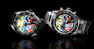
CAR201AA.BA0714
TAG Heuer Boutique / Sheffield, January 26th 2019
My first impression of this wasn't great to be honest, but like the second generation Alec Monopoly Formula 1, this actually looks better close up that it does in the pictures. I'm not really a fan of this though, it still looks a little bit of a mess and the subdials do rather get in the way of the design, but it doesn't look as tacky as I expected it to.
I can't help liking the Formula 1 version and I still kinda wish I'd jumped on the original release, it just seems to make more sense to spend £1000 on a 'fun' watch than £4900, which is what this Carera Heuer 01 costs. From what I gather talking to staff in the shops, most other people feel the same as the Formula 1 is selling reasonably well and this one... not so much.
To be fair to Alec, the dial layout doesn't offer much in the way of space to work with. It might have been an idea to ditch the date window and provide a bit more real estate and maybe they should have ditched the shield while they were at it. They could also have changed the 'Tachymetre' text on the bezel to 'TAG Heuer' instead, and perhaps done something a bit more interesting with the rest of the bezel that was more pertinent to Alec. Just a thought.
It will be interesting to see come the next generation whether we get another Monopoly Carrera, or whether it will revert to a Formula 1 only edition. I think the problem here may be that the customers are more 'Alec Monopoly' fans rather than watch enthusiasts, and the F1 is a relatively 'cheap' way to own a piece of Alec's 'art'. From that perspective the F1 with it's clean open dial makes more sense as the dial is all important here, so maybe it would have made more sense to go with a non-chronograph Aquaracer instead, possibly in a 43mm case to give plenty of space for art to breathe?


No comments:
Post a Comment