


CAZ101N.FC8243
Looking at this official rendering of the new Formula 1 Gulf Special Edition, it's hard not to imagine this thing flying off the shelves. It's stylish looking, affordable and it astutely rides the coat tails of the new Monaco Gulf SE, because let's face it, not everyone can afford a £5000 watch, and, well believe it or not... not everyone likes square watches.
In all honesty, I've always had mixed feelings about the Gulf Monacos. I kind of like them, but at the same time I always thought they never got them looking quite right. I think the new one is definitely the best one they've done, but if I'm honest I still don't feel like I would drop that kind of money for it.
A few weeks ago I came across a WAH1013 for sale at FineTimeWatches.com (which is where my WAH1110 originally came from), it looks in excellent condition and at £799 was more than a little tempting.

So far I've managed to resist, because a) it's still £800, and b) I just bought a Grand Carrera! But it's a pretty cool looking little watch all the same. The new version though, looks so much more... mature, let's say. Indeed, the Formula 1 range as a whole is looking a lot more 'together' than it used to, which is to be applauded, of course. But there's undeniably something 'fun' about these slightly older, slightly more rough around the edges pieces. While the new one looks like it would be the perfect watch to wear to a bar, this one looks like the perfect watch to strap on before you gun it up the hill at Harewood in your self-built Lotus Seven.
But don't get me wrong, that's more an observation than a criticism...
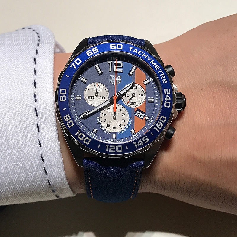
Because unfortunately the criticism starts with this photograph, because clearly the blue stripe looks nothing like the one on the render and it's clearly far too close in tone to the main dial colour. True, this picture is from Baselworld and it could well be a pre-production model that needs a little more finessing - we really won't know for sure until the proper release - but it's worrying that it looks so wrong, when the render version looks so right.
That said, overall the new model is clearly an attractive proposition and the blue does give it a fresher, cleaner look. But given that the watch is a Formula 1 and therefore at the cheaper end of the range, it's likely that that lovely blue bezel insert is aluminium and highly prone to scratches. Which is a shame, but ceramic isn't cheap and blue ceramic is apparently not the easiest thing in the world to make either.

So, colour scheme aside, what we're really looking at here is your basic F1 Chrono 1/10th of a second, 200M. £1350 quartz TAG, albeit on a very odd looking strap. The guys over at Calibre 11 forum seem quite excited about this strap, but me personally... I'm not sold. I think it's a bit of blue too far and I'd much prefer to see this on a bracelet or some kind of black leather or rubber (or both) strap, if nothing else it would complement the black pushers instead of fighting them as this blue strap seems to.
Let's give them the benefit of the doubt for now and hope that when we see this in the stores in a few months time that blue is bang on the money, if not it's going to be a bit of a shame. I guess the only other question mark is the case size, which at 43mm will surely be too big for some people, perhaps there will be a three hand 41mm along later?
No comments:
Post a Comment