Sunday, 8 April 2018

OWNED/DUEL: Aquaracer Calibre S versus Aquaracer Chronotimer


'DTF' on the Calibre 11 forum suggested I do a comparison post on the Chronotimer and the F1 Kirium because they have the same ani/digi movement inside them. I will do that, but it seemed to make more sense to 'duel' these two as they are both recent purchases and both share a similar case and bezel.

PRICE AND AVAILABILITY
If you want a Chronotimer, it's not really a problem, just hit up eBay and you will find several for sale ranging from about £700 on a rubber strap to about £1000 or maybe a bit over. However, pretty much every one that I looked at had a bezel that looked like it had been in a motorbike accident, so I found one in a jewellers and paid £950 for it. The watch is in great condition, but the box is a bit tatty, especially where the previous owner has gouged the leatherette around the cushion with his fingers getting the watch in and out. Also the wallet for the booklet is a bit tatty too and every time I open the box pieces of black debris litter my desk, but the booklet is perfect and the package included the warranty card, a service card from TAG, and I also got a twelve month warranty from the jeweller.


The Calibre S wasn't a massive problem to find, but they definitely seem a bit harder to pin down than the Chronotimer and in my experience the black dial is a lot easier to find than the yellow which was the one my heart was set on (there's also a blue one but I didn't come across that one at all). I could only find two on eBay when I was looking, and again both looked as if they'd lived hard lives, one was from Japan and had a lump out of the top lug (£1700) and the other one I think was about £1250, but again with a very scratched bezel. This time I plumped for Watchfinder and offered them £1150 (it was listed at £1275, but there was a 'Make Us an Offer' thing going on at the time) and collected it from their Bond Street(ish) store a few days later. Because this one had been bought from Bicester Village only a few year ago it came with all the right bits and bobs and in a pristine brown-style TAG Heuer box. My only gripe really was that Watchfinder had stuck a sticker on the outer box and it left a nasty sticky mess on the surface which was not easy to remove.

DESIGN
I think most people would say the Calibre S is a nicer looking watch than the Chronotimer, although perhaps not everyone would choose the yellow dial. At first glance it appears that the dial is yellow with a slightly more orangey centre section, but on closer inspection it becomes apparent that the dial is actually uniformly yellow with a series or orange/red rings in the middle. I wasn't too sure about that to start with, I would maybe have preferred the dial to just have been yellow, and maybe a bit of a stronger yellow at that, but as I've worn the watch I've got used to it and now I like it the way it is. I think the black elements of the dial and the black inner edge of the bezel contrast superbly with the bright dial and when this watch is on a black rubber strap the effect is even more pronounced, but more on that later.


Amusingly, if you look back on the blog, you will find that I actually reviewed the Chronotimer about a year ago and though I said generally good things about it I was quite outspoken about the chrome edging around the lower digital display. But perspectives change and I started finding myself looking at those Breitling Aerospaces, which inevitably led back to the Chronotimer... and here we are. I must say, in photographs that silver edging looks a lot thicker than it really is, and it really depends on how the light hits it as to how much you can see it and how thick it looks.

The Chronotimer is quite a shiny watch, the hands and indices are very reflective, which isn't always great for legibility actually, but overall it's a pleasing design. I don't want to talk about the Kirium too much here because I do want to post about that separately, but because I own both it's hard to ignore the obvious similarities and their respective strengths and weaknesses.


I'm sure the Chronotimer won't appeal to everyone, the digital displays cut into the dial are probably going to be a bit Marmite and the curved upper one even more so than the lower oblong window. I must admit the aforementioned Breitling Aerospaces look a bit neater, but they are also quite a lot more expensive, and TAG were clearly working with the movement they already had (the ETA E20.321) which dictated the window layout. I think the yellow dial versions look a lot more messy than the black dial, which is one of the reasons why I opted for the yellow Calibre S, and oddly I've seen pictures of the yellow dial versions with and without the reflective silver surround on the bottom display. I don't know whether that's because it fell off, someone took it off, or because TAG made some with and some without... but to be honest on the yellow dial it kinda looks better without it. (Now I come to look for a picture, of course, I can't find one without it, which rather suggests it was just one watch on eBay, which I suppose might even have been a fake).

The bezel is the same on both watches, and what I didn't actually realize until I bought these watches is that the black section of the bezel is fixed and only the silver outer part revolves. It's quite a neat design as it allows you separate the 'bezel' minutes from the 'chronograph' minutes (let's gloss over the fact that the Chronotimer's chronograph is 'digital' only shall we... ahem). But anyway, it's kinda neat and very unexpected when you turn the bezel for the first time and realize they are two separate sections.

Both Aquaracers shown on my substantial 7.3/4" wrist.

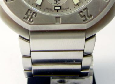
The bracelets and clasps are essentially pretty similar, except that the Calibre S has polished centre links whereas the Chronotimer's are brushed. I'm guessing TAG thought the Chronotimer was shiny enough without adding any more bling on the bracelet. I think I need a half link taking out of the Chronotimer, which is possibly why it's not as comfortable as the Calibre S, the clasp seems to dig into my wrist more when I'm sitting at a desk which could be because it's not sitting snugly. The CAF7013 is very comfortable on the wrist, not as comfortable as the Kirium perhaps - which is definitely my most comfortable bracelet - but definitely a good wearer and a lot less cumbersome than my Aquagraph (which is definitely not a watch for everyone, not least because it weighs as much as a small car).


On the back the Calibre S has a flat back plate whereas the Chronotimer has the circles cut into it, I'm not sure if they have some sort of purpose or whether it's just an aesthetic thing, but it certainly looks a bit more interesting. Perhaps they are designed to let the skin breathe, in much the same way some rubber straps have indents on the back? I'm not really sure...

FUNCTIONS AND USABILITY 
The Chronotimer (like the F1 Kirium of course) is blessed with a plethora of functions, including a second time zone, 1/100th chronograph, digital time, countdown alarm, daily alarm, date and calendar. By contrast the Calibre S has just a 1/100th chronograph and a date (which is displayed using the sub-dials at the bottom when the chronograph is not in use). As far as usability goes, both are a bit of a faff to set up and you definitely need a booklet or a handy YouTube video to help you out, but once set up, the Calibre S only really has the chronograph to play with and that's fairly easy. All you have to do is press the crown in and the hour, minute and second hands reset to 12, while the sub-dials both reset to zero. Pressing the top pusher starts the chronograph (indicated by the second hand) and pressing it again stops it. Once the chronograph is halted, the two sub-dial indicators come into play to indicate the 10ths and 100ths of a second. A push on the bottom pusher resets the chronograph to 12, and finally, pushing the crown in again restores the hands to the correct time. But the really clever bit is that you can push the crown in while the chronograph is functioning and switch between chrono-time and actual time.

The Chronotimer has many more gadgets to play with, which are accessed by turning the crown and then using the pushers to start, stop and set. But some of them are really fiddly and indeed when I got my watch the daily alarm was set on and it took me quite a while to figure out how to turn it off, even with the booklet in front of me. It clearly told me how to turn it on if it had been turned off, but it didn't actually say how it could be turned off. I eventually pressed the button which was supposed to turn it on and realised it turned it on and off. Hardly rocket science, but the booklet should really have been clearer.

The Chronograph is easier to access and functions as you would expect, but most of the other functions I wouldn't really use, I mean I've had my Kirium for thirteen years and I've barely used them on that - I clearly haven't used the daily alarm for one thing!

So is the Chronotimer a waste then? Not at all, if this was your main watch and you were the sort of person who did use it's functions I'm sure you would pick up the necessary skills to operate it without resorting to the manual, but for me it isn't and I won't, but that doesn't mean I don't appreciate it's capabilities. As always with me, I buy watches that I like the 'look-of', rather than the functions... so while I'll probably never really use a chronograph, I like the look of sub-dials so I buy chronographs. And I like the look of the Chronotimer, so I bought a Chronotimer.

CAF7013 Calibre S                      CAF1010 Chronotimer

Lume on both watches is pretty good, slightly better on the Calibre S I'd say, but then the Chronotimer does have a back light for digital functions, so overall you'd have to say the Chronotimer wins there (although only the Calibre S can do it's party trick in the dark of course).

CONCLUSION
I genuinely like both watches and have no regrets about buying them, but if I could only keep one then it would definitely be the Calibre S. The chrono-function is so unspeakably cool that you can't help pressing the crown just to see the hands moving to 12 and back again, it's surely the ultimate in fiddle factor and engages you with the watch hugely. Indeed, so taken am I with the Calibre S movement that I even started looking at Calibre S Link models, and I never look at Links....

I think the Chronotimer is a lot of watch for £950, but I don't know if I would have paid much more for it. By contrast I think I would have been willing to pay a fair bit more for the Calibre S if I'd had to. I don't know what their respective original RRPs were, but I'm guessing the Calibre S was probably higher, and rightly so. After all, the Chronotimer, while I do enjoy it's company, is basically a bit of a compromise, an existing movement taken from the F1 Kirium and cut into the dial of an Aquaracer (in a far less stylish manner than in it's original setting it must be said), while the Calibre S was a new design from the ground up and really wows the owner.

If like me, the Breitling Aerospaces give you a warm fuzzy feeling, but you don't have £3000 to tickle that particular fancy, then maybe the Chronotimer is a relatively affordable route to something similar. If, on the other hand, you want something outrageously different and technically advanced, then the Calibre S is surely the way to go. To be honest I can't really believe they've discontinued using the movement because as far as I can tell, no one, least of all TAG themselves, have got anything like it in the range anymore and that's such a shame.

CAF1010.FT8011                             CAF7013.FT8011

When I originally bought my Chronotimer, I figured if I could find the Calibre S on the rubber strap then I would have the best of both worlds, with two watches able to share the bracelet and the rubber (I didn't realize that the bracelets were slightly different at the time, but they are still interchangeable). However, of course, I ended up getting both on the bracelets, so I've ordered an FT8011 rubber strap and am expecting it to arrive in a few weeks. Originally my intention was to put it on the Calibre S, mainly because it gives more of that black/yellow contrast, and because I wasn't convinced about the yellow dial/steel bracelet look. But since I've owned this, I've grown to like that combination, and having seen some photos of the Chronotimer on the rubber, I have to say it looks pretty good. Still it's nice to have the option and it will be fun to chop and change...

VIDEO: TAG Heuer Calibre 1 Real/Fake Review by Peter von Panda


Saturday, 7 April 2018

ON THE WRIST: TAG Heuer Aquaracer GMT Calibre 7 Pepsi Bezel

WAY201F.BA0927

Ernest Jones, Sheffield / 7th April 2018

Eight months since my first sighting and I still hadn't tried one of these one, at least until today. After I tried on the new Monaco Gulf 50th Anniversary I thought I might as well give one of these a go, and to be honest I'm still a bit undecided about it.

The bezel looks good, albeit being an aluminium insert rather than ceramic, how long it will remain looking good is open to speculation. The cyclops however, is a disaster. I don't know if it's because the date wheel is black with white text, but the date appears as nothing but a big blurry mess to me. I know I'm not a fan of the old cyclops, but this one seems particularly bad.

The watch has a steel back, which is pretty standard for the 300M Aquaracers, and the bracelet and clasp seem perfectly 'adequate', but no great improvement over, for example, the bracelet and clasp on my Calibre-S CAF7013. The dial is nice enough too, but somehow I couldn't really get excited about it and to be honest I'd have rather put this bracelet on the new Khaki quartz and been done with it. It's a decent size (43mm) and looks better on the wrist than it does in the window, but then all the 43mm Aquaracers look over-sized in the window for some reason.

While I've always been a sucker for colour on watches, I've never been one to get over-excited about the whole Pepsi bezel thing and this hasn't really changed my mind. It will be interesting to eventually see the new 'Batman' bezel Carrera GMT, I have a feeling that one is going to look better than this, just as I always thought the Rolex Batman looked better than the Pepsi GMT.

When I previously wrote about this watch last July, I said the price in the window was £2350, I don't know if that was a mistake or what, but the price is now £2200, which seems pretty fair overall for a Calibre 7 GMT in a 43mm Aquaracer case on a bracelet. I guess if you are a fan of the Pepsi bezel then this is an affordable route to ownership, but with the new Tudor Black Bay GMT coming on to the market at about £2500, this one certainly has it's work cut out for it in the coming months.

VIDEO: TAG Heuer Kirium Quartz Watch Review by UKWatchReviewer


ON THE WRIST: Heuer Monaco 'Gulf' 50th Anniversary Edition

CAW211R.FC6401

Beaverbrooks, Sheffield / 7th April 2018

I must admit to being more than a little surprised seeing this in the window today, and pleasantly surprised at that. It must be said that I'm not the biggest fan of the 'classic' Monaco, I've tried on several and I've liked them, right up until I got them on my wrist... but this one I actually liked even on the wrist. I don't know if it's the classic Gulf dial or what, but somehow this one just 'works' in a way that so many others just haven't, at least for me...

The first thing I noticed about this one was that the background is actually a very dark blue, whereas I had kind of assumed it was going to be black. Not only that but it's kind of metallic too so it gives off a cool sunburst effect when the light hits it at the right angle. The second thing I noticed was that the sub-dials aren't white, in fact they look like silver to me - though I'm not 100% sure about that. They look fine anyway, and indeed, despite much debate about the colour scheme in general (and the red accents in particular) I have to say it looks great when you actually see it close up.

Flip the watch over and you've got your regular display back, although because this one was covered in cling film and labels I couldn't see very much at all, which was a shame, but I don't think there's anything under there that I haven't seen before to be honest.

The strap is actually a lot darker than I expected as well, so at first glance you might even think it was black, and the orange stitching definitely gives it a certain something too, though I wasn't overly sold on the clasp with it's huge Heuer branding. The watch sat very nicely on my 7.3/4" wrist, looking just about right for a retro piece, and not at all feminine (unlike that overly-shiny, dainty looking quartz model I tried on in Sheffield last time!) and money no object if I was going to choose a (non 24 series) Monaco, this would probably be the one.

I did notice though that as people on the Calibre 11 forum have pointed out, the strap is maybe a little on the short side. The watch fitted me pretty much straight off, but I did observe that there wasn't much strap leftover, so if you've got an 8" wrist you might have a problem and need a longer strap for this one.

I must admit I'm slightly mystified as to why this is exactly the same price as the plain blue version, or at least it was in Beaverbrooks today. I guess some people would still choose the plain blue dial, but to me it's a no-brainer that this would be the one to pick up. That said, the price in question is a not inconsiderable £4750, and for not much more than that one could pick up a Calibre 36 Monaco 24 from the outlet, which to me seems like a much better deal (particularly as they sell on the pre-owned market for £6500). Even so, I'm sure there will be plenty of punters lining up for this new incarnation of the classic Gulf striped Monaco, and rightly so.

VIDEO: TAG Heuer Ladies Diamond Bezel Aquaracer by I Review Watches


ON THE WRIST: TAG Heuer Quartz 'Khaki' Aquaracer

WAY101E.FC8222

TAG Heuer Boutique, Sheffield / 7th April 2018

Last year at Baselworld TAG released two novelties in the Aquaracer range, the camouflage dial WAY208D and the Khaki WAY208E. I really liked the camouflage dial one (and still do in fact) but I found the Khaki a bit, well... a bit dull really. I really didn't like the way that when you angled the dial the gold TAG logo completely disappeared, and well, to be honest my feeling about both watches was that they were fun pieces (especially the WAY208D) but that by putting Calibre 5 movements in them they had priced them out of the 'fun' market somewhat. At various times over the last year I've thought about buying that 'Camo' model, because I love the dial... but I hate the strap and I hate the price. However, I'm sure if that model had been a quartz I would have bought one by now.
So it's oddly ironic that this new Aquaracer 'Khaki' is a quartz, because it's a much better looker, and presents itself in a much smarter fashion than the much more expensive Khaki Aquaracer of 2017. I'm not going to bang on about how much I hate NATO straps again, because, what's the point. This watch only comes on a NATO and to me that is a mistake. This would look great on a bracelet, and it would be an easy thing for TAG to offer to placate people like me.

But that aside, and the cyclops of course... (I thought the quartz models were going to escape that particular curse, but it seems not) this is a very smart watch indeed. I couldn't see the lume too well past curling my hand around the dial, but it looked okay even then and the gold and black aluminium bezel works very well indeed with the Khaki dial.

This is another watch that looks better in the flesh than in the render, though the photographs give a pretty accurate take on it.


Actually, aside from the struggle doing it up, I didn't hate the strap quite as much as I thought I would. It's certainly not the abomination that the camouflage one was, but I'd still much prefer it on a bracelet, and at £1300 it looks a lot more stylish than the regular quartz Aquaracers. Chiefly though, it can only make the old Calibre 5 Khakis even harder to sell, because this is clearly a much better looking watch for £1000 less!

Tuesday, 3 April 2018

VIDEO: TAG Heuer Calibre S Aquaracer Review by Breitling Source


FEATURE: The TAG Heuer Edge Watch and Chronograph


As great as Calibre 11 is, it can't just be me who is bewildered that I can find pages on that site through a Google search that I can't find on the site itself through the menus... which is probably why I've never seen this before.

The TAG Heuer Edge was designed at the tail end of the 90s and was apparently a victim of the LVMH takeover. To be honest I'm not sure that was a bad thing. It's certainly a Marmite kind of design and one that actually brings to mind the Victorinox Inox Diver for some reason, even though it's clearly not that similar in looks (perhaps it's the similarly brutalist design?)


It would seem that post LVMH TAG instead developed the Kirium, which to me is both a nicer looking watch and one that's surely less divisive. In a way this watch kind of reminds me of some of those weird looking cars you used to see at Motor Shows, which the kid in you wanted them to build, but the bean counters decided was too niche to be commercially viable.


As you might expect, all roads seem to lead back to Calibre 11 with very little information out there that doesn't reference the article linked below. But I did manage to find another article (also linked below) written by someone who had bought a watch made using one of the cases developed for the 'Edge' watch.

RLT-029

Believe it or not he purchased this hand made watch for the princely sum of £49.95, including a sapphire crystal. To be honest I'm still not sure I like it, but the orange dial does give it a certain something. 

It seems TAG were looking to offer this with a choice of dials including orange, yellow, metallic blue and a 'meteorite' grey, but that these were destroyed when the watch was ditched. For some reason the cases got out and I've found cases for sale on the internet, and clearly RLT got them from somewhere too.


The watches were intended to be made in three sizes, including a ladies version. Strangely the orange watch pictured above and featured in the article is said to have a lug width of 17.5mm, which seems a bit small for a gents watch? The picture above shows two Edge cases shown on TZ-UK forum, the one on the right is a ladies model, it's a shame we don't have photographs of all three cases together (Full size, mid size and ladies).

TAG also developed a bracelet unique to the Edge range, which gives quite a nice integrated look.


It's surprisingly easy to find supposed TAG Heuer 'Edge' watches for sale, although the majority, on closer inspection appear to be Edge cases fitted with other TAG Heuer dials and movements.


In this particular case (left) it appears a Limited Edition 2000 has been plundered for it's innards, note the 'Seychelles' logo on the dial at the 8 position and on the right it looks like some sort of 1000 series has been used as the donor.

CN111D 2000 Series

Actually this should give some insight into the size of the Edge case because the CN111D 2000 Series is a 39mm watch. Actually this model was limited to 3000 pieces, and is worth about £5-600 on it's own so whether it was really worth doing is debatable... I guess it depends on what the seller could realise from their 'rare' Frankenwatch? I guess since the availability of a genuine Edge is almost non-existent, these watches probably have some novelty value.


This one is clearly made from the remnants of a Formula 1... and perhaps this one got the bracelet from the CN111D?

I recommend visiting the Calbre 11 article, especially if (like me) you haven't come across it on the site / haven't been able to find it!


https://www.calibre11.com/tag-heuer-edge-chronograph-prototype/

http://paxman-wasting.blogspot.co.uk/2006/07/rlt-tag-heuer-divers-watch-rlt29_25.html

Sunday, 1 April 2018

VIDEO: Baselworld 2018 - Jean Claude Biver Interview by Watch Advisor


FIRST IMPRESSIONS: The Bronze Autavia Calibre 5 Watch


Before Bazelworld 2018 I only really had one prediction, and if you know anything about the watch world it wasn't exactly one which would cause a sharp intake of breath. Since Panerai launched the Bronzo bronze watches have been growing in popularity to the point where it was becoming strange that TAG didn't have on on their books.

So like I said, my one prediction wasn't exactly earth-shattering, and tchnically speaking... TAG Heuer haven't actually released their bronze watch yet. But there were a few things not launched at Baselworld that we still got to see, mostly thanks to Ace Jewellers Instagram account! There was the Autavia GMT and the three-hander Calibre 5 of course, both seen in photographs but not actually announced, and then there was this (above), which clearly shows a three handed Calibre 5 Autavia in bronze (on a leather strap).

Now I must admit, when I predicted a bronze watch at Bazelworld, I naturally expected it to come in the shape of an Aquaracer, because for some reason, bronze is automatically associated with diving (even though nobody's actually worn one of those helmets in a long time, or maybe they have, what the hell do I know about deep see diving?). We saw it with the Oris Carl Brashear Bronze, which celebrated the achievement of the first African-American to became a US Navy Master Diver (despite having one of his legs amputated), and latterly we've also seen the Tudor Black Bay Bronze along with some other limited editions such as the Black Bay Bronze Blue for Bucherer.


Now this one I actually quite like, but the problem is while it looks like gold now, eventually it will look grubby and patinated. But for some reason people love that, they want a watch that ages and takes on a grubbiness, they think it gives it character.... what's more people are even deliberately accelerating the process and putting chemicals on their watches to make them oxidise and change colour.


I'm sorry, but I really don't get this at all. To me that looks a total mess and I wouldn't go near it with a barge pole - but hey, each to their own!

So anyway, I anticipated a bronze Aquaracer, but of course what I didn't take into account was that the new range of Aquaracers are quite modernist in their styling, and so not really the ideal watches to bronzify, because all these other bronze watches are all playing the (slightly tired) vintage riff for all it's worth. On the other hand I did think the red bezel Aquaracer might go quite well with a bronze case, at least when it was new and the case still looked 'golden'.

So admittedly it never occurred to me at all that TAG might launch a bronze Autavia, because the Autavia isn't a dive watch*. But now that there's going to be a three hand version, it seems the Autavia's racing-chrono heritage is being thrown out of the window, so why not?

It's a bit of a conundrum, because it seems to me like the people who might appreciate a bronze TAG are exactly the sort of people likely to get very upset about the idea of a non-chrono Autavia, so it's going to be interesting to see how this one plays out. I suspect that perhaps TAG are looking to go head to head with Tudor for Black Bay business with the three handed Autavias, and if they are then they're going to have to price them accordingly - but then realistically there's no reason I can see why a Calibre 5 Autavia should be dramatically more expensive than a Calibre 5 Aquaracer. And perhaps, beyond the Calibre11 forum there might be plenty of potential customers who aren't died in the wool Autavia fans who won't actually care that the watch they are buying doesn't 'make sense'.

After all, at the end of the day, it's those people who buy watches 'just because they like them' that dictate the market, because they far outweigh the voices of those 'who know their onions'. In a way it reminds me of endless conversations I've had on Formula 1 forums with people who think their opinion matters more because they been watching the races since 1977, versus the huge mass of casual viewers who make up the vast majority of the actual audience. They don't seem to understand that 'purity of racing' doesn't count for much if the races are boring and the viewers are turning off the TV. Sure, pure racing has it's place, but it's not on a Sunday afternoon on Sky as a mass market event. If you want 'pure' racing then great, but that doesn't really gel well with sponsorship or public engagement. You can't have it both ways at the end of the day, and thus Formula 1 stumbles from one crisis to the next, endlessly trying to cajole the major players into giving up their historical advantages for the 'good of the sport'.


Anyhoo... to finish on a positive note, another picture that escaped Bazelworld was something that looks far more appealing (to my eyes). This white-dialed, black-cased, rubber-strapped Aquaracer certainly caught my attention, I wonder how long before this one is available on the High Street?


*Well, someone has since posted a photo on Calibre11 of an Autavia dive watch - so that's a turn-up for the books! Like I've always said, my knowledge of pre-TAG Heuer is very limited so I tend to take my lead from Heuer fans who I presume know what they are talking about - perhaps in future it would behove me to do my own research! :)

Saturday, 31 March 2018

FEATURE: TAG Heuer Regatta Watches

CAK211B.FT8019

Regatta watches play quite a small part in TAG Heuer's history, but they've been around for quite some time. Even back in the Heuer days the company was making sailing watches, including this rather cool 134.601 with a black PVD case.


This watch is actually currently for sale in mint condition on 'MandBWatches.com', for the sum of $5600... which is probably quite reasonable given Heuer's rising stock in the vintage market of late. It's a nice modern size too, which suits me (42mm) and don't you just love the way that orange and blue pops against that black dial. Awesome, probably my favourite Heuer yet!

TAG Heuer's first Regatta watch was the 2000 based Searacer (CK111R.BA0328), a fine example of which has just been listed on eBay with a B.I.N. price of £749.

CK111R.BA0328

The watch is described as being 42mm including the crown (I wish people would measure things properly) which sounds quite okay for a 'modern' wrist like mine (7.3/4"). I must admit I am rather tempted because I think the dial is really nice and I love all the green and red laid onto that crisp white dial.

A quick squint at the Calibre 11 article linked below suggests that to activate 'Regatta' mode one gives a long push on the upper chrono pusher. This drops the left hand subdial into the green portion as an indicator and then the red hand commences it's ten minute countdown. Once complete the watch returns to it's normal function and the chrono starts itself to measure the time of the race itself.

Apparently the watch was also available with a black leather strap (CK111R.FC8117) and both watches are said to have been supplied with an additional nylon strap for wearing over a wetsuit.

I've read in at least two separate places (including Calibre 11, which is usually spot on) that there was also a Searacer based on the S/EL and I feel like I've seen it, but for the life of me I cannot find a picture or a reference number anywhere.

Next up came the Link models, these were available in three dial colours: black, blue and silver.

CT1113.BA0550                  CT1115.BA0551                  CT1114.BA0551

As you can see from the photographs, the blue and silver dial variants came on a bracelet with alternately brushed and polished links, whereas the black dial model's bracelet features only brushed links. As far as the dial size goes, from various sources I'm reading that the case measures either 40mm or 41mm, or 45mm with the crown and given that the crown does look fairly substantial on this I'm guessing it's probably not far off.

All three seem to sell around the £600-750 mark in good condition, though I would have thought the blue dial might attract a slight premium over the other two.


If I'm honest I think I prefer the 2000 series version, at first glance these look like standard chronographs, whereas with the original Searacer it's pretty clear that something's up right from the start. Which is probably why the next watch caught my eye, the CT1118.BA0550 Oracle Racing Edition.

CT1118.BA0550

I posted about this recently and I'd still like to actually see one of these to see exactly how it looks in real life. I'm still slightly bemused about the black dial version which is very hard to find out anything about, indeed all I can find is this one single picture...


In the picture above the silver dial watch looks really nice, but then in the picture below it looks really different.


It's quite annoying and it puts me off bidding for one of these on eBay or something because I really need to see it in the flesh to figure it out. I do think this one looks better than the previous version because it's clearly not a standard chronograph. They've taken away the silver ring around the subdials making them disappear into the dial more and that red stripe up the left side surely gives a clue that this is something out of the ordinary.

Moving on we come to the Calibre S Regatta watches, which were launched in 2005. Again at first glance you could be forgiven for thinking these were standard Calibre S's but on closer inspection the countdown bezel gives the game away. 

CAF7110.BA0803

This was intially available in two colours (Blue - CAF7110, and Anthracite - CAF7111) and both were offered with either the steel bracelet (BA0803) or a rubber strap (FT8010). A year later in 2006 TAG launched a new limited edition variant of the Calibre S Regatta to celebrate their collaboration with the 'China Team' sailing operation.

All these watches were 41mm (which I'm surprised about as my own Calibre S is 43mm). 

CAF7112.BA0803 Team China Limited Edition (2000 pcs)

These watches continued to be part of the catalogue for a couple of years before being dropped, and it wasn't until 2011 that a new Regatta watch was released. Perhaps producing 2000 pieces of the Team China edition was slightly optimistic as these watches are still around in the outlets twelve years after being released!

CAJ2111.FT6036

In truth, 2011's watch wasn't so much a Regatta watch as a Calibre 16 Aquaracer with a logo on the dial... which is, not that interesting really, although it's quite a nice looking watch. I have a slightly odd relationship with these bezels, sometimes I think they look interesting and different and sometimes I just think they look terrible. I do like the rubber strap though and the pinstriped face is a neat look.

Thankfully just a year later TAG gave us a couple of 'proper' Regatta watches again, this time containing the Calibre 72 movement.

CK211A.FT8019

This was released in two versions, the standard version shown above and the 'Oracle Team' version shown below. Both were available on either the rubber strap (FT8019) or the bracelet (BA0833).

CK211B.BA0833

Again, I've seen these in the outlets, so they probably weren't the best of sellers and while I kind of like their general look, one thing that kind of disappoints me is that those 'Regatta' counter squares don't flip or something. I may be asking too much, I don't know how technically challenging that would be, but I've seen a Louis Vuitton Regatta watch which does that.... 

Okay, I've just checked and that watch is about $40,000! Fair enough...

The Americas Cup, and sailing in general, is something I know very little (indeed nothing) about. But I gather the competition has been in a state of some disarray in the last few years with teams pulling out of it left right and centre as various rule changes have been brought in costing teams huge amounts of money in wasted development. 


The race was last held in 2017, where the holders 'Oracle Racing' lost their title to the Emirates team. As far as I can see there doesn't seem to have been any TAG Heuer sponsorship on the boat, and I'm certainly not aware of any Regatta watches that have come out since the CK211A/B's.


https://www.calibre11.com/tag-heuer-sailing/
http://www.regatta-yachttimers.com/brands/heuer/
http://www.regatta-yachttimers.com/brands/tag-heuer/

VIDEO: Heuer Skipper Hodinkee Review by Watchbox


Friday, 30 March 2018

UPDATE: The TAG Heuer Enthusiast Gallery Blog


I am in the process of adding about 300 (I know I can't believe it either...) entries to the 'Gallery Blog'. This has mainly come about because I found that on Watchfinder's site they have a 'Sell Your Watch' section which has quite substantial lists and pictures of (presumably popular) models, or perhaps these are the models they have previously had through their doors?

I still have more than a hundred left to add on, which is slightly laborious to say the least... so do me a favour and go check it out. It's not immediately apparent, but if you move your cursor to the top right part of the page where the black line is, you will find there is a pop-out which enables you to view the labels. This lets you choose model ranges or even individual model numbers.

Click HERE to visit the Gallery Blog.

Sunday, 25 March 2018

VIDEO: Baselworld 2018: TAG Heuer Novelties by The Watch Advisor


FEATURE: The Golden Hours Watches

188.205

Unless you are familiar with the history of TAG Heuer and Heuer, you may be surprised to learn that the watch pictured above was available from the company as late as 1988. This was a time when the line-up was a bit of a mish-mash of old Heuer models like the 'Titanium' and 'Airline' which were being sold alongside the new, very 'TAG Heuer' Formula One range as well as other crossover favourites like the 1000, 2000 and 3000 series (for my sins I'd love a 3000 series, they are so gloriously 80s, but far too small for me to ever wear).

It's kind of funny to me that in these days of endless 'heritage' re-issues and a constantly backwards looking watch industry digging out anything and everything they can to celebrate and turn into an 'Anniversary' model, that most people have no clue that these watches even existed. Let's be honest, if TAG Heuer announced a moonphase watch at Bazelworld people would be scratching their heads and thinking 'where in the hell did that come from?', and it would be one thing to say 'well, Heuer made these back in the 1950's (I have no idea if they did), but few people would believe that TAG had sold such a watch in the last thirty years.

721.208

Oddly, it's possible to find examples of watches such as the 321.208 above with either the classic 'Heuer' logo or the 'Ed Heuer Co' script on the dial. I wonder if perhaps it is the later versions that were changed to 'Ed Heuer Co' since presumably TAG didn't want to sell watches with 'Heuer' on the dial and they thought (quite rightly) that the red and green TAG logo would look horribly out of place.

The 'Golden Hours' range wasn't huge, indeed it seems to have comprised of just four watches by 1988: 721.208, 721.508 (similar to 721.208 but with white subdials), 188.205 and 188.215 (similar to 188.205 but with a different lug arrangement and thinner strap).

Since I knew so little about these watches I Googled them and immediately came across a 188.205 for sale on Chrono 24. The watch looks in immaculate condition (it is listed as unworn) and is being offered for sale for 2100Euros.


The watch is 34mm in diameter and contains a Lemania Calibre 1883 movement, the lens is plexiglass and if you look closely you can see that the brown leather strap is in fact stamped 'TAG Heuer' (which seems a bit odd if I'm honest).

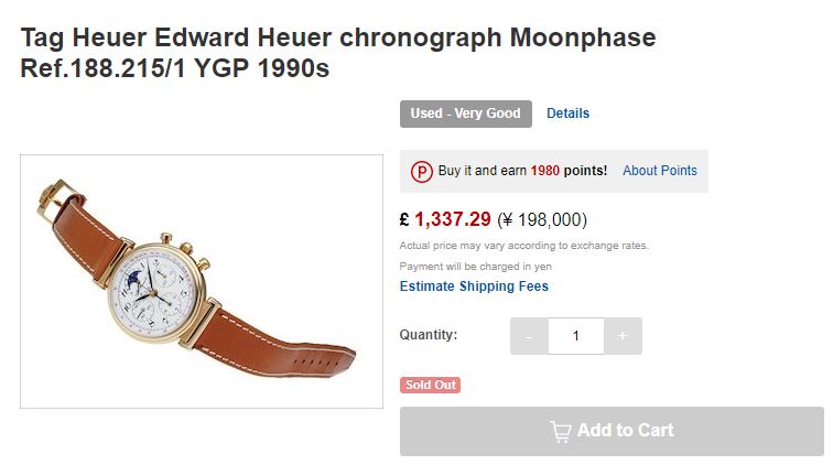
I also managed to find a 188.215 on 'Global Rakuten' for a much more affordable £1337. It seems that the watch itself is largely the same as the 188.205, apart from the way the strap attaches to the case. On the 188.205 you have the standard lugs you find on most wristwatches, whereas on the 188.215 you have the kind of a arrangement you tend to find on watches that either are, or allude to being, pocket watches for the wrist. This listing adds the informantion that the movement is hand wound and also that the watch is 'recommended for indivuiduals'... I guess that was lost in translation.


I've also managed to find a 721.508, this time on 'Watches-for-sale-online.com', but if you want one of these you're going to need to find a bit more cash. This one is listed for sale at £8250, which I suspect is partly because it has the classic 'Heuer' logo on the dial rather than the Ed Heuer Co script.

721.508

This one has a 38mm case and is 47mm lug to lug, the case is 18k gold and the lug width is 19mm, it's described as being in 93% condition - which is pretty precise, and is supplied with a crocodile strap (it doesn't say whether the strap is original or not).


Lastly, I discovered that a 721.208 was sold by Bonhams last June for £14,375. This one came on a bracelet and measures 36mm across the face. Personally I think this is by far the nicest of the four watches and (leaving aside the size) would definitely be the one I would choose to wear. I think the full gold dial looks great, especially with the blue moonphase complication.

721.208

I've also found another example that sold last year, this time on a strap. This was sold by Christies last November and was dated to 1986. This was put up with an estimate of 70-100,000HKD and achieved the top end of that (£9020). But I'm really struggling to find one with the 'Ed Heuer Co' logo to compare prices. I can well imagine that these are rarer, but I'd wager the lack of the classic Heuer logo would compromise the price significantly. Funnily enough I did come across someone asking on an eBay forum if their watch marked 'Ed Heuer Co' rather than TAG Heuer was a fake though... so they're obviously out there!

I'm pretty sure it won't happen, but I'd definitely appreciate a re-issue of the 721.208 either in gold or stainless steel. I think it would be a nice addition to the range and if it was upsized to 39mm it would be big enough for me but not too big for the proper Heuer fans.

Saturday, 24 March 2018

VIDEO: TAG Heuer Carrera Calibre S Review by Jack C


FIRST IMPRESSIONS: Carrera Heuer 02 GMT 'Batman' Chronograph

CBG2A1Z.FT6157

Unlike the Autavia GMT (there's still some 'hopeful' speculation over on the Calibre11 forum that that one just may be a bad joke...) this new Carrera 'Batman' really looks the business. Sure the black/blue colour theme isn't to everyone's taste (but then what is?) and of course there will be the obvious criticism that the 'Batman' scheme is Rolex specific

Well, it's not as if TAG Heuer haven't used this scheme before, both the Formula One Calibre 7 and the David Guetta Special Edition both used the blue/black bezel scheme and not much was said. But then I guess it's a different matter when the scheme is rolled out on a luxury model on the very day that Rolex announce they are discontinuing their own version.

I'm sure there would have been murmurings too if TAG had used the 'Pepsi' red/blue bezel scheme, even if Heuer produced red/blue schemes way in the past does that actually mean anything to the majority of TAG's audience? It means something to Heuer afficionados sure, but it doesn't actually prove anything. So what, they made a red/blue bezel in the past, big deal. Like it or not the 'Pepsi' bezel (like the cyclops) is a 'Rolex' thing, and when the Aquaracer GMT came out, I'm betting a lot of people saw it in the stores and thought 'Oh wow, cool, it's like the Rolex (I can't afford) - I want one'.

After all, how many variations can there realistically be on a GMT bezel, you either go for a single colour, or you go for red/blue, blue/black or red/black, all of which are 'recognized' as Rolex schemes. Sure you could go mad and go for yellow/green, but you won't sell many outside of Brazil.

A lot of people are beefing about the Autavia GMT because 'historically' there's never been a non-chronograph version (ergo TAG are pissing all over the Autavia's legacy). That to me is irrelevant, the problem with the Autavia GMT is it's ugly and it doesn't work well as a design - to be fair, I feel the same way about the three handed (so called) Mutant Carrera module in the Connected. If the three handed Autavia looked nice, then I honestly wouldn't have a problem with it. 

I think to be honest, launching a three handed Autavia was always going to be slightly difficult, and it perhaps should have been approached a lot more carefully than by just chucking the Calibre 7 movement inside and giving it a divisive bezel design as a starting point. 

To be honest, I really don't think it matters two hoots whether Heuer made a blue/black bezel in the past or not, the question that matters is does it look good now?

CBG2A1Z.BA0658

Clearly on the Carrera it looks great, I think I prefer it on the rubber strap, but that's been par for the course for me on just about every modern Carrera I've seen. I just don't like the way the lugs form a shoulder on the bracelet, when the rubber smooths it out in a more aesthetically pleasing way.

I must admit it would have been nice if they had built this in a titanium case with a thin blue band around it, following the design of the original 'red' version, but still perhaps it's better if the black half of the bezel stands out against the case more?

The bezel is ceramic, and so should stay scratch (but not fingermark) free and the case size is 45mm. It'll be interesting to see this one close up, it looks like that red GMT hand is really going to pop, but I still don't like the 4:30 date window on these new Heuer 02 Carreras. I guess it will become normal eventually, I mean my everyday Formula One has a 4:30 date window, but right now it seems to jar a bit. Still, better that than putting it at 12 which in my opinion is almost always a huge mistake.

I guess one can't help compare two 'Batman' style watches that have been launched so closely together (although 'launched' is perhaps a bit strong as we've still not seen anything truly 'official' from TAG as yet on the Autavia) and for me the clear winner is the Carrera. It just looks 'right', in contrast to the Autavia, which just looks 'wrong'. It will certainly be interesting to compare the pricing of the two models, surely the Autavia won't stand a chance against the 3-6-9 style Carreras unless there is a distinct price advantage, but will TAG want to undermine the Autavia's percieved value?

Thursday, 22 March 2018

FIRST IMPRESSIONS: TAG Heuer Autavia GMT


Ace Jewellers have posted this.... 'watch' on their Instagram today (which I'm not sure they should have actually, but hey-ho... that's their problem, not mine), and they asked the question 'Yay' or 'Nay'. I can only hope, that this is a one off that TAG have made to gauge feedback, because clearly the answer is 'No, No, No - Jesus Christ Jean Claude what the HELL ARE YOU THINKING?'

The Calibre 7 Formula One wasn't the best looking watch in the world, but it was okay, what's more it was cheap. As I recall, when I reviewed it I was somewhat thrown when I realised that it was in fact automatic, since the price led me to believe it was in fact quartz.

The Automatic F1 GMT - Currently selling for £1650

But the fact remains, it's dial looked a lot better than this flat, featureless, boring mess... and unless TAG are selling this for well under £3000 (not on your nelly) then they are seriously taking the piddle. An Autavia case doth not cost that much more than a Formula One case to make I'm quite sure... perhaps it's £1500 extra for the case and £1200 extra for the ceramic bezel (assuming it is ceramic?)

Wow, I'm quite shocked by how BAD this is, and I can't see why anyone would choose this over the Carrera Heuer 02 GMT.

SPOTLIGHT ON: TAG Heuer Link Oracle Racing Edition

CT1118.BA0550

Many times I've stressed the importance of 'seeing' a watch, it's amazing how many times a promising photograph can lead to disappointment, or a uninteresting photograph can turn out to be something worth persuing. So when I came across this photograph (above) a couple of weeks ago while browsing on eBay, I perhaps should have known better than to get too excited straight away. For the most part I've never been that keen on the 'Link' range, in fact I much prefer the old S/EL models - they just seem to have a bit more character, but this one really grabbed my attention and I was seriously interested in purchasing it (this was before the whole Aquaracer buying frenzy, obviously!).

However, once I started doing my homework, something quickly became apparent which completely changed my mind. And that was simply that the dial, despite looking white in the picture above, is actually silver, which to my mind completely ruins the effect!


I mean it's okay, but the red hand and regatta countdown stripe look so much better red on white than red on silver... don't you think? Speaking of the regatta stripe, I'm a little confused by the markings on this watch. Usually regatta watches have a five minute countdown, which can be displayed in many inventive ways (especially on Louis Vuitton watches) but this appears to have a ten minute one (the markings on the rehaut) so my guess is that the red hand does the countdown and the red stripe gives you the last twenty seconds on the last revolution. Something most of us won't probably use but something to play with all the same...

If I remember correctly this watch was on sale for about £1150, and it looked in immaculate condition (this seller only seems to sell watches that are in excellent form), and it's so nice to see a Link that looks really unusual and different, but I just wish the dial was white not silver.

This watch was limited to 1500 pieces and a company called Milton's Diamonds currently have one for sale for £1399, should you be interested.
https://www.miltonsdiamonds.com/watches-c26/link-ct1118-oracle-racing-ltd-edition-2003-p2663


There also appears to be a black dial version, but I'm struggling to find out anything about it... I do wish TAG would paint in the numbers on the Link dials, they always look cheap and unfinished to me.

Wednesday, 21 March 2018

FIRST IMPRESSIONS: Carrera Heuer 01 China Space Exploration Limited Edition

CAR201J.FT6046

Limited to just 100 pieces, this 43mm Heuer 01 Carrera has been released to celebrate TAG Heuer's partnership with the Chinese Lunar Exploration programme... not quite sure if it is actually called the 'Hidden Side of the Moon' or if that's a little joke at Omega's expense?  I wonder if it comes in a box the size of a small car....

Anyway, looks like a titanium case and a ceramic bezel, so far so ordinary, but then there's that dial. Sandblasted anthracite apparently, which I must admit does look pretty neat. Then there's that yellow pusher detail, which may not be to everyone's taste (I like yellow on watches so count me 'in') but seems to join with the red one on the top pusher to recall the Chinese national flag.


The back of the watch has a clear caseback, but with half of it covered over with some sort of lunar landing vehicle, which is pretty neat as long as you don't want to get too good a look at the movement. Still I'm guessing the likely buyer for this might potentially already own some sort of Heuer 01 so probably not a big problem.

Generally speaking I'm still finding it a little difficult to warm to these new solid dial Carrera's but this is definitely a step in the right direction. I think the black gold (?) sub-dial edges work really well with the anthracite dial, as opposed to the more normal silver coloured ones which seem to jar a bit - mainly because they are so thick.